

Have you ever tried to shop on a website that didn't work well on your phone? It can be super frustrating, right? Just imagine trying to find a gift or order your favorite food, but the buttons are too small, and pages take forever to load. It’s enough to make anyone want to throw their phone out the window. That's where a mobile-first strategy comes in. This is a way of designing websites and apps that puts mobile users first, making their experience smooth and easy.

In today’s world, where more and more people are using their phones to browse the internet, businesses that focus on mobile-first design will likely do better than those that don't. It's not just about having a pretty website. It's about creating a space where your customers can easily interact with your business, no matter where they are. Let’s take a closer look at why adopting a mobile-first strategy is crucial for your business success.
Understanding a Mobile-First Strategy
What Exactly Is Mobile-First Design?
A mobile-first strategy starts by designing for mobile devices before considering laptops or desktops. It’s like when you’re building a toy for a kid; you want to make sure it’s safe and fun for them first before you hand it over to an adult. This method recognizes that more than half of all web traffic comes from mobile devices. Why? Because people like to browse and shop while they are on the go.
When websites are designed with mobile users in mind, they are often simpler, faster, and easier to navigate. This can make a big difference for people trying to interact with your business, such as making a purchase or finding information quickly. For more insights on how to create a mobile-friendly experience, check out our guide on essential website business strategies for 2025.
The Growth of Mobile Usage
People Are Online All the Time
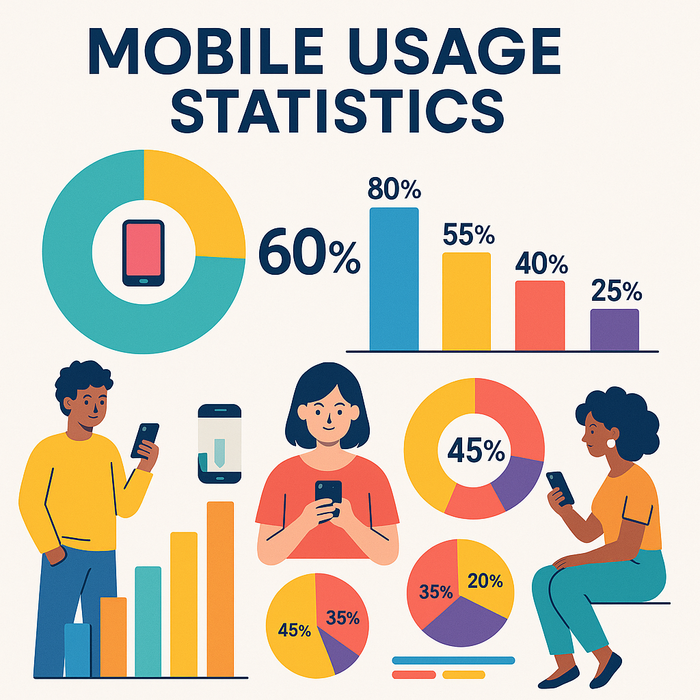
Think about it. How many times do you check your phone in a day? If you are like most people, the answer is quite a lot! Studies show that over 60% of people prefer to access the internet through their mobile devices. This means your potential customers are always just a tap away.
If your website doesn’t work well on a phone, you could be losing many customers without even knowing it. Let’s say someone is trying to find new shoes for a special occasion. If they visit your site but can’t easily browse through your products, guess what? They might leave and find another store that works better on their phone. It's all about making it easy for them to stay and shop. For more on this topic, read our post on digital marketing ROI to learn how optimizing user experience can impact your bottom line.
Key Benefits of a Mobile-First Strategy
Better User Experience
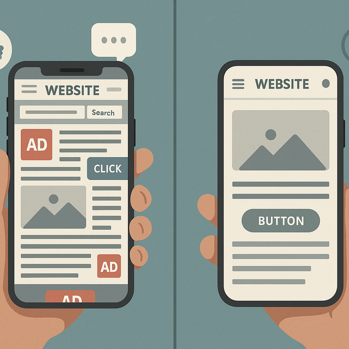
Imagine you are at a library where everything is in a gigantic format, and you have to squint to read anything. That’s how users feel when they visit a site that isn’t optimized for mobile. Focusing on mobile-first design leads to enhanced user experiences. This means that your website will load faster, and navigation will be easier, leading to happier customers.
Having a mobile-friendly site also encourages visitors to stay longer and engage more with your content. This ultimately means they are more likely to trust your brand and make a purchase. For strategies on how to enhance user engagement, consider checking out our article on unlocking customer engagement through gamification.
Boosting SEO Rankings
Search engines like Google pay attention to mobile-first design. When your website is mobile-friendly, it can actually rank higher on search results. This means more people will find you when they search online. If your site lacks responsive design, it might hurt your visibility. In the digital world, being seen is extremely important for driving traffic to your site and building a loyal customer base. To expand on how SEO and digital marketing intertwine, our guide on SEO strategy should be highly beneficial.
Increased Conversion Rates
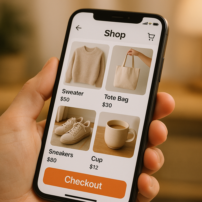
When people can easily browse your site on their phones, they are more likely to buy something. A smooth mobile experience can reduce cart abandonment rates. If filling up a cart is complicated or slow, users might ditch the whole thing. On the other hand, a streamlined checkout experience can feel like a breeze. This boosts conversion rates and helps your business succeed.
Reaching a Broader Audience
A strong mobile presence opens your brand to many potential customers. Today, younger customers are using their phones more than ever. By designing a mobile-first website, you can target this audience effectively. When your business is accessible on their favorite devices, they are more likely to choose you over competitors. Learn more on reaching wider demographics in our analysis of marketing trends for 2025.
Real-World Examples of Mobile-First Success
Success Stories to Inspire You
Many big companies have adopted a mobile-first approach and seen great success. For instance, Amazon focused on optimizing their site for mobile and witnessed a significant increase in mobile sales. This was due to their user-friendly app, which made browsing and shopping super simple for everyone.
Another great example is Airbnb, where users can quickly book their accommodations using their mobile app. This convenience has contributed to their massive growth in the travel industry.
Starbucks has also made excellent use of mobile-first design. Their app allows customers to order ahead, which saves them time. This simple act of convenience has resulted in happier customers and increased loyalty.

Best Practices for Implementing a Mobile-First Strategy
Practical Tips to Get Started
Taking the plunge into a mobile-first strategy can seem daunting, but it doesn’t have to be! Here are some tips to make the transition smoother:
- Keep It Simple: A clean layout with clear buttons and easy navigation works wonders. When designing for mobile, focus on providing essential information without cluttering the screen.
- Improve Loading Speed: People don’t like waiting for websites to load. Optimize images and minimize code to keep your site speedy.
- Responsive Design: Make sure that your content looks good on all devices! Websites that adjust according to the screen size provide a consistent experience, whether on a phone or a desktop.
- Collect Feedback: It’s important to hear from your users. Encourage them to share their thoughts on usability, so you can improve their experiences continuously.
- Regular Testing: Conduct regular tests on different devices to ensure users have a smooth experience. This can help identify issues and improve overall functionality.
The Future of Mobile-First Design
Getting Ready for Tomorrow

Mobile-first design is not just a trend; it’s the future. As technology evolves, more features like augmented reality and voice search will change how users interact with mobile devices. Businesses that continue to adapt and embrace these changes will thrive in a competitive marketplace.
The rise of 5G technology will also enhance mobile connectivity, allowing businesses to create even more engaging mobile experiences. It’s essential to stay informed about these trends to keep your business relevant.
A mobile-first strategy paves the way for long-term growth. When businesses prioritize mobile users, they lay the foundation for a brighter future.
In summary, if you haven’t embraced a mobile-first strategy yet, now is the time! By adopting these principles, businesses can improve user experiences, raise their SEO rankings, and increase sales. Happy mobile users lead to happy businesses.
If you’re looking to kickstart your mobile journey, consider evaluating your current online presence. It’s a great opportunity to improve and adapt to what customers seek! Start today and watch how your mobile-first strategy transforms your business!


